- Home
- Blog
- Blog Post Formatting Guides
- How to Format a Blog Post Like a Pro: The Ultimate Guide to Presenting Your Blog Beautifully
How to Format a Blog Post Like a Pro: The Ultimate Guide to Presenting Your Blog Beautifully
Imagine pouring your heart and soul into writing the perfect blog post, only to find readers bouncing away within seconds. Ouch, right?
You might assume your ideas aren’t compelling enough, but hold that thought. In reality, it might be your formatting that’s turning readers away.
When someone lands on your post, their brain subconsciously scans for signs of clarity, readability, and structure. If they’re faced with a chaotic wall of text, even the most brilliant content might be left unread.
That’s why learning how to format a blog post is crucial—not just for looks, but for impact.
Good formatting enhances readability, supports SEO goals, and boosts the chances your content will be shared, bookmarked, and remembered. It’s not just an aesthetic choice—it’s a strategic one. And here’s the kicker: Google rewards well-structured posts because they provide a better user experience.
In this guide, we’ll break down the anatomy of a perfectly formatted blog post, using proven strategies, storytelling flair, and SEO wisdom straight from the folks at Yoast and content experts worldwide.
So, if you’re tired of blending into the background of the blogosphere, let’s make your posts sparkle—pixel by pixel, paragraph by paragraph.
Understanding the Anatomy of a Blog Post
Before we dive into tools, tricks, and tactical formatting moves, let’s understand what makes up a blog post structurally. Think of it as a human body—each part has a function, and when all work harmoniously, you get a healthy, high-performing piece of content.
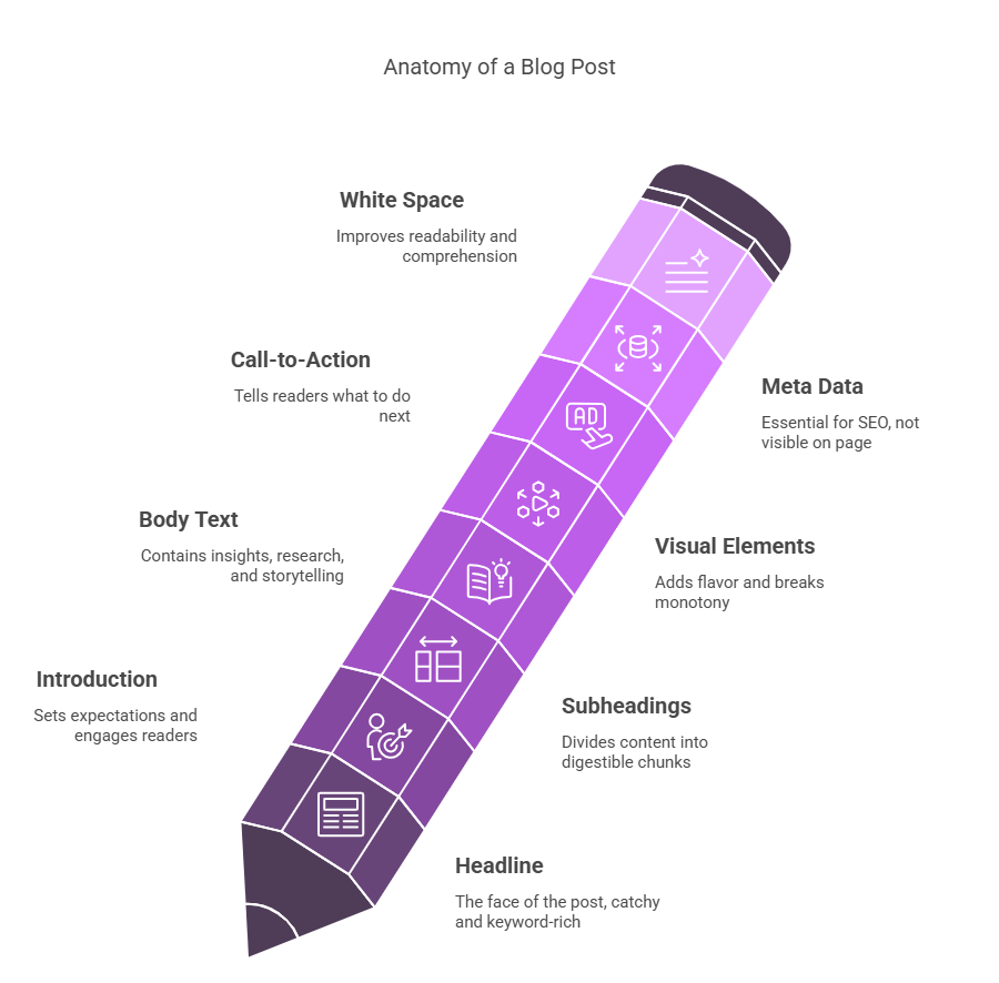
Here’s a breakdown of the core components:
- Headline (H1): The face of your post. It should be catchy, keyword-rich, and promise value.
- Introduction: The handshake. It sets expectations, pulls the reader in, and teases what’s to come.
- Subheadings (H2, H3): These are your road signs. They divide content into digestible chunks.
- Body Text: The heart and soul. This is where your insights, research, storytelling, and value live.
- Visual Elements: Images, infographics, and videos that break the monotony and add flavor.
- Call-to-Action (CTA): The closer. It tells readers what to do next—subscribe, comment, or click.
- Meta Data: Not visible on the page, but essential for SEO. Includes the meta title, meta description, and slug.
Much like baking a cake, you can’t just throw ingredients together and hope for the best. Each part needs thoughtful assembly and attention. For instance, Yoast’s recommendations encourage using your focus keyword in at least 30-75% of subheadings and ensuring the text has ample transition words and short sentences to maximize readability.
And let’s not forget the Flesch Reading Ease Score, a key metric in the Yoast SEO tool. A score of 60-70 is considered solid for web content—clear, accessible, and digestible by a wide audience.
Another overlooked part of the anatomy? White space. Don’t be afraid of it. It gives readers a chance to breathe. In fact, studies show that text with plenty of spacing improves comprehension by up to 20%.
Once you master these building blocks, you’re no longer just writing a post. You’re crafting a delightful reading experience—one that Google and your audience will both thank you for.
Choosing the Right Headline: First Impressions Matter
They say you never get a second chance to make a first impression—and when it comes to blogging, your headline is that all-important first impression. In fact, studies show that 80% of people will read a headline, but only 20% will go on to read the rest of the blog. That’s a steep drop-off, right? So, if you want to win your readers’ attention, your headline better pack a punch.
When thinking about how to format a blog post, the headline might seem like a no-brainer—just slap it on top, right? Not quite. A well-formatted blog headline does more than sit pretty. It’s strategic, concise, and optimized for both human readers and search engine algorithms.
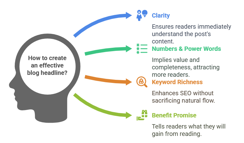
Here’s what makes a headline click-worthy:
- Clarity over cleverness: While witty wordplay is fun, don’t sacrifice clarity. People should immediately understand what the post is about.
- Use of numbers and power words: Headlines like “7 Secrets to…” or “Ultimate Guide to…” convert better because they imply value and completeness.
- Keyword-rich (but natural): Yes, sprinkle in your focus keyword—like “how to format a blog post”—but avoid stuffing. It should flow naturally.
- Promise a benefit: Tell your readers what’s in it for them. Will they save time, learn something new, or solve a problem?
Let’s compare two headlines:
- Formatting Blog Posts
- How to Format a Blog Post Like a Pro: The Ultimate Guide
The second one tells the reader exactly what to expect and signals expertise. It also contains the exact phrase “how to format a blog post,” which is great for SEO.
From a formatting standpoint, make sure your headline is:
- Marked as an H1 (just one per page).
- Placed prominently at the top.
- Styled distinctly (bigger font size, bold, eye-catching).
Lastly, test different headline formulas using A/B testing or tools like CoSchedule’s Headline Analyzer. Because no matter how good your content is, if the headline flops, the rest doesn’t matter.
Structuring Blog Posts for Skimmability

Let’s face it: nobody reads blog posts word-for-word anymore—at least not on the first go. Readers skim. They scan. They look for visual cues and juicy snippets. So if your post looks like a dense block of academic text, most readers will bounce before they blink.
Here’s where smart formatting becomes your best friend.
How to format a blog post for skimmability starts with breaking the post into digestible sections. Every few hundred words should be a new chapter in the story—with its own subheading, visual aid, or list.
Tactics to Boost Skimmability:
- Use subheadings (H2, H3, H4) generously to divide your content. Each should give a sneak peek into what the section covers.
- Keep paragraphs short—ideally 2-4 sentences. This makes them less intimidating and easier on the eyes.
- Add bullet points and numbered lists for steps, features, or tips. People love a good list—they’re quick to scan and easy to remember.
- Bold or italicize key phrases to help highlight important info.
- Use images or infographics to break up text and visualize key takeaways.
Here’s an example:
👎 Poor formatting:
“Blog formatting is crucial. Without it, readers won’t engage with your content. It’s important for SEO too. When your post is broken into sections, readers stay longer. This lowers your bounce rate and increases conversions.”
👍 Well-formatted version:
Why blog formatting matters
Blog formatting isn’t just about aesthetics. It keeps your reader engaged and boosts your SEO game by:
- Lowering bounce rates
- Increasing dwell time
- Improving content comprehension
Much better, right?
Remember: scannable doesn’t mean shallow. It means easier to access. And when readers find your content easy to navigate, they’re more likely to stay, engage, and share.
Using Subheadings Effectively
If your headline is the front door, subheadings are the hallway signs directing people to where they want to go. They structure your post, give context, and make the content easier to consume.
When you’re learning how to format a blog post, mastering subheadings is non-negotiable.
Why Subheadings Matter:
- They break up the content: No one likes reading an unending wall of text. Subheadings segment your content into digestible pieces.
- They support SEO: Google uses subheadings to understand what your post is about. Using your focus keyword in H2s or H3s (naturally!) is a smart move.
- They help users scan: Subheadings act as guideposts, letting readers jump to the part they care about most.
Tips for Effective Subheadings:
- Use H2 for main sections, H3 for sub-sections, and H4 for deep-dives or specific list items.
- Include your focus keyword, such as “how to format a blog post,” where relevant.
- Make them clear and benefit-driven. A subheading like “Why Paragraph Structure Matters” is much better than “Paragraph Stuff.”
Let’s see a practical example:
👎 Bad subheading: “Details about formatting”
👍 Good subheading: How to Format a Blog Post for Maximum Engagement
Subheadings aren’t just formatting tools—they’re content strategies in disguise. They encourage readers to continue scrolling, improve your post’s SEO, and even help voice search algorithms understand your structure.
Use Yoast SEO’s subheading distribution analysis to ensure you don’t go more than 300 words without a subheading. Keep an eye out for red or orange lights in the readability tab—those are warning signs.
How to Format a Blog Post for Readability
So, what is readability, really? In simple terms, it’s how easy your content is to read and understand. And spoiler alert: it’s not about “dumbing down” your writing—it’s about opening up your message to more people. That’s a powerful shift in mindset.
When thinking about how to format a blog post, readability should be at the core of every choice you make—from sentence structure and vocabulary to spacing and visual hierarchy. Why? Because even the most insightful post will flop if your readers struggle to get through it.
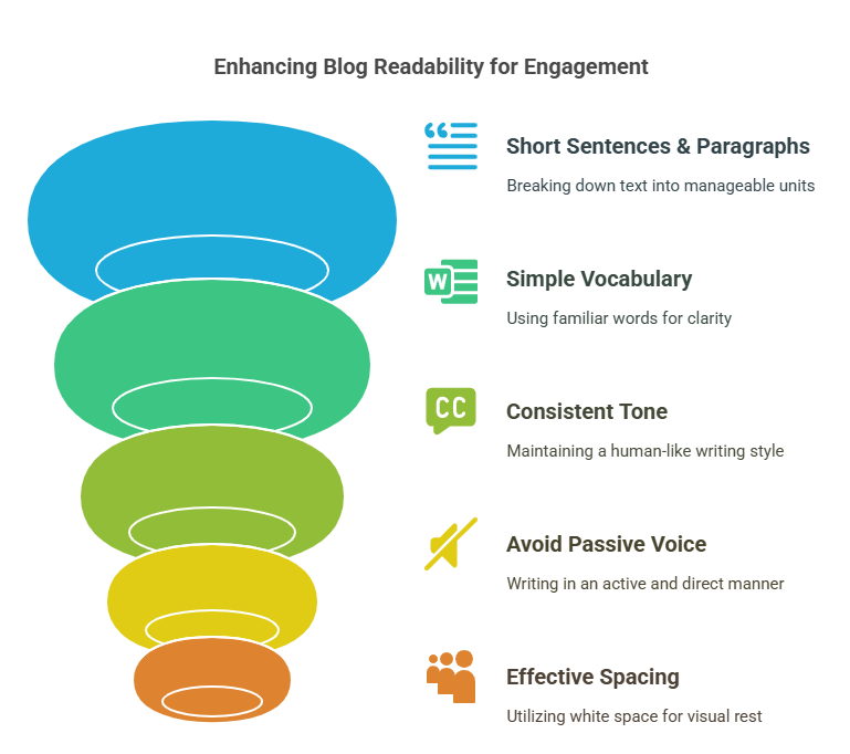
Key Elements of Readability:
- Short sentences and paragraphs: Aim for no more than 20 words per sentence, and keep paragraphs between 2-4 lines.
- Familiar, simple vocabulary: Choose “use” instead of “utilize” and “start” instead of “commence.”
- Consistent tone and flow: Write like a human. Use contractions, occasional questions, and an approachable tone.
- Avoiding passive voice: It’s easier to say, “The author wrote the blog” than “The blog was written by the author.”
Yoast SEO checks all these things in its readability analysis. It flags long sentences, low transition word usage, and overuse of passive voice.
Also, let’s not forget the power of spacing. White space isn’t wasted space—it’s breathing room. It allows the reader’s eyes and brain to rest, encouraging deeper engagement with your content.
Readability Checklist:
| Element | Best Practice |
|---|---|
| Sentence Length | Under 20 words |
| Paragraph Length | 2-4 lines |
| Passive Voice | Less than 10% of the text |
| Transition Words | In 30%+ of sentences |
| Flesch Reading Ease | Aim for 60–70 |
Use this table while editing your post to keep things reader-friendly and search-engine approved. When your content is more readable, bounce rates go down, engagement goes up, and conversion chances skyrocket.
Using the Flesch Reading Ease Score to Your Advantage
Now let’s dig into a magical little number that can make or break your post’s readability: the Flesch Reading Ease Score.
Found in the Yoast SEO plugin under the Insights tab, this score tells you how easy it is to read your content.
It’s calculated using two main factors:
- The average sentence length (number of words)
- The average number of syllables per word
The result is a score between 0 and 100. The higher, the better. Here’s how to interpret it:
| Score | Readability | Ideal For |
|---|---|---|
| 90–100 | Very easy | 11-year-olds |
| 80–90 | Easy | Teens |
| 70–80 | Fairly easy | General audience |
| 60–70 | Standard | Web content (ideal!) |
| 50–60 | Fairly difficult | Professionals |
| Below 50 | Complex | Academics or experts |
How to improve your score:
- Chop long sentences into two. Even elegant prose can be split without losing meaning.
- Replace big words with simpler synonyms. Instead of “commence,” use “start.” Instead of “demonstrate,” go with “show.”
- Avoid jargon unless absolutely necessary. And if you must use it, explain it.
Example Transformation:
Before (score: 45):
The implementation of such strategies necessitates a multifaceted approach encompassing numerous variables.
After (score: 68):
To apply these strategies, you need to take several steps.
See the difference? Easier words. Shorter sentence. More clarity. Done right, this tweak makes your post friendlier for all readers—not just fellow experts.
And here’s the beauty: improving your Flesch score also improves your SEO. Search engines reward content that’s accessible and engaging because that’s what users want. So yes, this little number packs a serious punch.
The Art of Paragraphing in Blog Posts
Now that we’ve talked sentences, let’s zoom out a little and look at paragraphs—the unsung heroes of formatting. When you’re figuring out how to format a blog post, structuring your paragraphs well is one of the easiest and most effective ways to boost readability.
Here’s the thing: big blocks of text are intimidating. Your content could be gold, but if it looks like a textbook from the ’80s, your reader will probably hit the back button. So let’s rethink the way we build paragraphs.
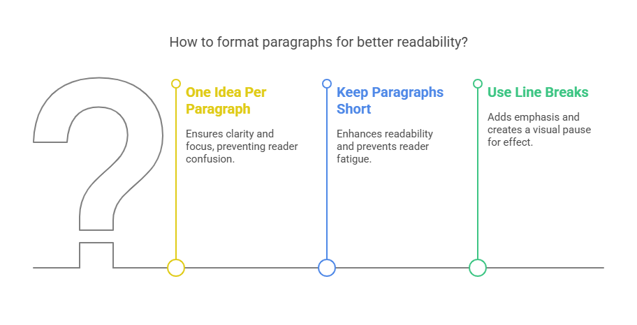
The Golden Rules of Paragraphing:
- Stick to one idea per paragraph. Start with your main thought, then explain or expand.
- Keep it short and snappy. No more than 3–4 sentences is ideal. If a paragraph feels too long, it probably is.
- Use line breaks for emphasis. A standalone sentence can add drama or pause for effect.
Let’s look at a quick example:
👎 Before:
“Blog formatting can make your writing look more professional and easier to read. It’s important for SEO and user experience. Long paragraphs are hard to follow, especially on mobile. That’s why you should keep them short and focused.”
👍 After:
Blog formatting helps your writing look polished—and more importantly, easier to read.
It’s not just about aesthetics, either.
Well-structured paragraphs improve SEO and boost user experience.
On mobile, long paragraphs are especially hard to follow. So break things up. Keep them short. Stay focused.
See how the second version guides the eye, creates rhythm, and feels more human?
Also, tools like Grammarly and Hemingway App can be great paragraph-polishing sidekicks. And of course, Yoast SEO’s readability check will tell you if your paragraph length is out of control.
When in doubt, break it out.
Sentence Length: Short and Sweet Wins
A common pitfall for passionate bloggers? Long, winding sentences that try to do too much at once. We get it—you’re excited. You want to pack it all in. But clarity > complexity. Always.
Let’s keep it simple: short sentences are easier to read. That’s not a suggestion—it’s a fact backed by readability studies and SEO data alike.
Yoast SEO actually flags any sentence longer than 20 words, and for good reason. Readers process short sentences faster. They retain more information. And they’re less likely to get distracted or confused.
How to Keep Sentences Short and Effective:
- Cut the fluff. Phrases like “in order to” can usually be replaced with “to.”
- Split compound sentences. Instead of using “and” or “but” too much, make two separate sentences.
- Use punctuation smartly. A period is your best friend. Don’t be afraid to use it more often.
Let’s refine this beast of a sentence:
👎 “In order to increase readability and also ensure better SEO performance, bloggers must format their content using multiple strategies that include but are not limited to using headers, breaking up content into smaller chunks, adding visuals, and making the text scannable.”
👍 “To boost readability and SEO, bloggers must format their content. Use headers. Break up long sections. Add visuals. Make it scannable.”
Boom—clean, confident, and compelling.
Short sentences don’t just make your content more readable. They add energy. Rhythm. They keep people hooked.
Mastering Transition Words to Guide Readers
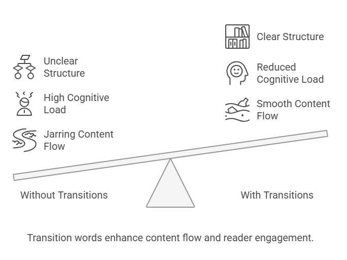
Imagine a story that jumps from one scene to another with no warning, no buildup, and no explanation. Jarring, right? That’s exactly what happens when you skip transition words in your blog posts.
Transition words are the glue that holds your thoughts together. They guide readers from one sentence, idea, or section to the next—like stepping stones across a river of information.
Yoast SEO takes transitions seriously. In fact, it expects at least 30% of your sentences to include them to pass its readability check. That’s not just a recommendation—it’s a golden rule for web content writing.
What Are Transition Words?
They’re words and phrases like:
- Addition: moreover, furthermore, in addition
- Cause & Effect: because, therefore, as a result
- Comparison: similarly, likewise, on the other hand
- Clarification: in other words, that is to say
- Time: meanwhile, afterward, at the same time
- Conclusion: in conclusion, to summarize, in short
Here’s a before-and-after example to show how much smoother transition words make your writing:
👎 Without transitions:
“Formatting is important. It helps readers understand your content. SEO improves too.”
👍 With transitions:
“Formatting is important because it helps readers understand your content. As a result, your SEO improves too.”
Why Transitions Matter for Formatting:
- They enhance flow, making your blog feel like a conversation.
- They reduce cognitive load, helping the reader follow your logic without working too hard.
- They highlight structure, making your ideas more persuasive and polished.
And remember, variety is key. Don’t just repeat “also” or “however.” Mix it up!
If you’re serious about learning how to format a blog post, mastering transitions is essential. They may be small, but they make a massive difference.
Font Choices and Typography Tips
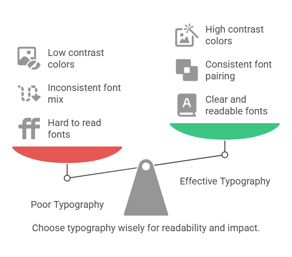
Let’s be honest—if your text looks ugly, no one’s going to read it. It doesn’t matter how brilliant your content is. Bad fonts = bad experience.
The design of your typography directly affects the visual clarity and emotional tone of your blog. Choosing the right fonts is a critical part of formatting—and one that’s often overlooked.
What Makes a Font Blog-worthy?
- Readability: Stick to clean, sans-serif fonts like Open Sans, Lato, Roboto, or Arial. Fancy script fonts may look stylish, but they’re hard to read.
- Consistency: Don’t mix too many font types. Stick to two max—one for headings, one for body text.
- Size matters:
- Headings: 22–32px
- Subheadings: 16–20px
- Body text: 14–16px (not smaller than 14px for mobile)
Formatting Tips to Consider:
- Use bold sparingly to highlight keywords or important phrases.
- Italics are great for emphasis or quotes.
- NEVER write in ALL CAPS—unless you want to shout at your reader.
- Line height should be around 1.5–1.75 for body text.
- Keep background and font color contrast high—black on white is classic and accessible.
Here’s a visual example comparison:
👎 Poor typography:
Font: Papyrus
Size: 12px
Line Height: 1.2
Mixes 3 different font types
Low contrast (grey on grey)
👍 Effective typography:
Font: Lato (headings) + Open Sans (body)
Size: 16px
Line Height: 1.6
Black text on white background
The difference is night and day.
Remember: content is king, but readability is queen—and she rules with style.
Visual Hierarchy: How to Layer Information
Ever walked into a messy room and didn’t know where to look? That’s what a blog post without visual hierarchy feels like. Everything blends together, and nothing stands out.
Visual hierarchy is the intentional layering of your blog elements—text, images, buttons, headings—so readers naturally know what to read first, second, third, and so on.
When learning how to format a blog post, this concept is a game-changer. It’s what separates amateur blogs from professional ones.
Elements of Visual Hierarchy:
- Size: Bigger = more important. Headlines should be larger than subheadings, and so on.
- Weight: Bold text draws attention first.
- Color: Use contrasting colors to highlight calls-to-action or quotes.
- Spacing: Group related content closely together and separate distinct ideas with whitespace.
- Position: Readers follow a Z-pattern on screens. Place key info where eyes naturally go.
Practical Applications:
- Use larger H1 tags for titles, smaller H2/H3 for sub-sections.
- Highlight quotes using styled blocks or pull quotes.
- Use visual cues like arrows, icons, or buttons to direct attention.
Here’s how hierarchy works in action:
👎 Flat hierarchy:
All text is the same size and color. Everything looks equally important—and therefore, nothing feels important.
👍 Layered hierarchy:
- H1: How to Format a Blog Post (32px, bold)
- H2: Subheading Example (24px, bold)
- H3: Tips and Tricks (20px, italic or semi-bold)
- Paragraph text (16px, normal)
By organizing content with intentional hierarchy, you guide your readers through your narrative—making your message stick.
How to Format a Blog Post with Images
You’ve heard the saying: “A picture is worth a thousand words.” Well, in blogging, a picture might also be worth a thousand engaged seconds.
Images do more than beautify your post. They enhance understanding, create emotional impact, and give readers a break from the text.
But here’s the kicker: not just any image will do. If you’re learning how to format a blog post, strategic use of images is non-negotiable.
What Images Should You Include?
- Header image: Sets the tone right at the start.
- Infographics: Summarize data and boost shares.
- Step-by-step visuals: Great for how-to posts and tutorials.
- Screenshots: Ideal for walkthroughs and technical posts.
- Custom graphics or icons: Reinforce branding and style.
Best Practices:
- Use alt text for every image—include your focus keyword at least once (e.g., “how to format a blog post”).
- Compress images for fast loading. Tools like TinyPNG help.
- Stick to a consistent style and color palette.
- Avoid generic stock photos. Choose relevant, specific images.
Formatting Tip:
Place your images every 300–500 words to keep the reader visually engaged. Use captions where it helps add context or humor.
Example Image Strategy:
- Blog Title: Hero image with text overlay
- Introduction: Branded visual summary or quote
- Midway: A bulleted infographic summarizing key takeaways
- End: Author image + CTA graphic
Well-placed images boost your time-on-page, reduce bounce rates, and can increase shareability by up to 94%.
And hey—don’t forget image SEO. Google Image Search is a traffic goldmine!
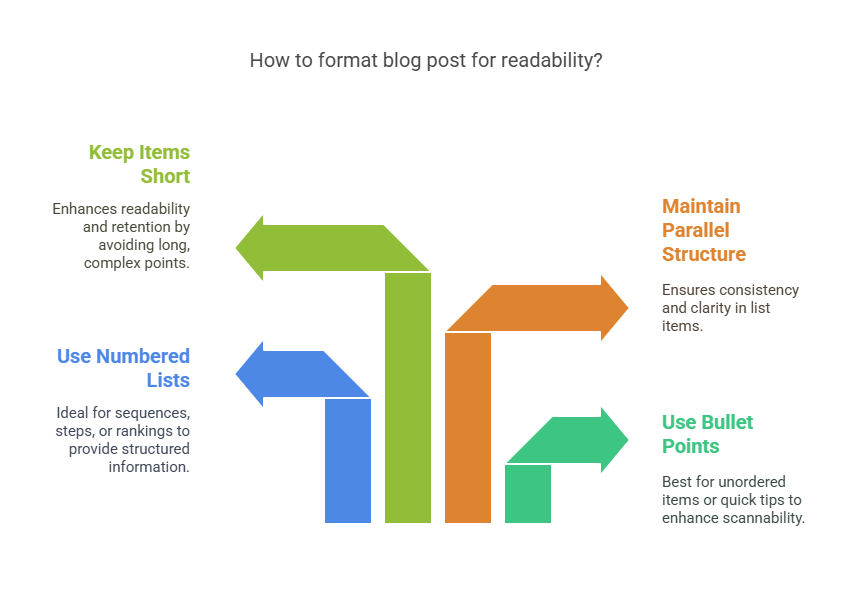
Using Lists, Bullet Points, and Numbering
Let’s be honest: long blocks of text are intimidating. No matter how juicy the information, if it’s buried in a dense paragraph, readers will likely skip it. That’s where lists and bullet points come to the rescue.
When it comes to how to format a blog post, lists are one of the most powerful yet underrated tools. They organize thoughts, simplify complexity, and improve scannability.
Why Lists Work:
- They break up text and offer visual relief.
- They draw attention to key ideas quickly.
- They increase retention—people remember information better when it’s structured.
When to Use:
- Bullet points for unordered items or quick tips.
- Numbered lists for sequences, steps, rankings, or priorities.
Best Practices:
- Keep each list item short and snappy—1 to 2 lines max.
- Start each point with a strong action verb.
- Avoid stacking more than 7–8 items unless necessary.
- Maintain parallel structure: start each point the same way grammatically.
Here’s an example comparison:
👎 Buried in text:
“You should choose the right font, make sure your paragraphs are short, use visuals, apply headings, and add calls to action.”
👍 Formatted list:
To optimize your blog post’s readability, you should:
- Choose the right font and size
- Keep paragraphs between 2–4 lines
- Use visuals every 300–500 words
- Break content with informative subheadings
- Include compelling CTAs
Much clearer, right?
Lists aren’t just decorative. They’re strategic—both for user experience and SEO.
Highlighting Important Information
Ever skimmed a post looking for “just the important stuff”? We all do it. And when bloggers highlight key points effectively, it makes our job as readers much easier.
Learning how to format a blog post involves knowing how and when to emphasize text to create visual anchors and rhythm in your content.
Tools to Highlight Content:
- Bold text for key ideas or takeaways.
- Italics for emphasis or subtle cues.
- Blockquotes for statistics, testimonials, or external insights.
- Colored boxes or backgrounds for pro tips or warnings (especially useful in how-to posts).
Quick Do’s and Don’ts:
✅ Do:
- Use bold to emphasize keywords or core ideas
- Use color sparingly and consistently for brand alignment
- Pull out 1-2 impactful sentences as callouts or quote blocks
❌ Don’t:
- Bold entire paragraphs
- Overuse emphasis tools (if everything’s highlighted, nothing is)
- Use red or flashing text—it’s jarring and outdated
Example of emphasis in context:
Pro Tip: Always use your focus keyword like “how to format a blog post” in one or two subheadings, not all of them. That’s what Yoast SEO recommends.
Highlighting helps the reader navigate what matters most in your blog. It makes content easier to digest—and memorable.
Formatting Quotes and Citations
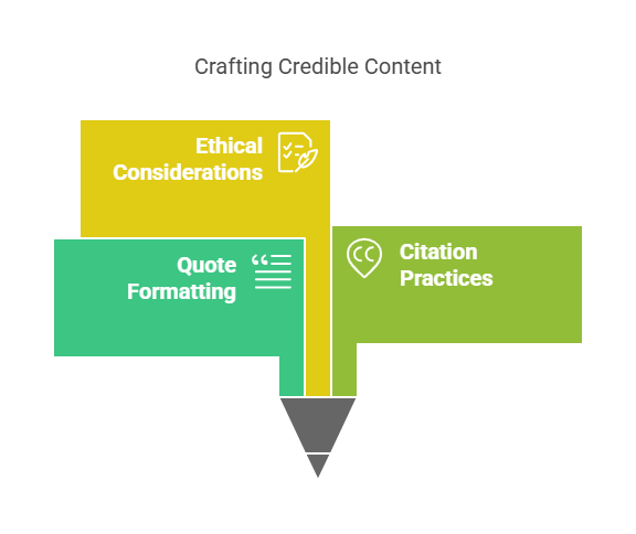
Blogging doesn’t happen in a vacuum. Sometimes you’ll quote experts, cite studies, or reference other posts. And how you format these pieces can elevate your blog’s credibility and clarity.
Why Quote Formatting Matters:
- It gives credit where due.
- It enhances trust by showing authority or data.
- It breaks up content visually (especially with blockquotes).
How to Format Quotes:
- Use blockquote styling for longer excerpts.
- Attribute the quote—either inline or directly after the block.
- Link to the original source when available (this helps with outbound SEO too).
Example blockquote:
“Content is fire, social media is gasoline.”
— Jay Baer, Marketing Author
For inline citations:
- According to a 2023 HubSpot study, 47% of readers skim blogs before deciding to read them fully.
When quoting data, always cite the original source, preferably with a link. Not only is it ethical—it boosts your authority in Google’s eyes.
Bonus:
Use quotes at the beginning of sections for emphasis, in the middle for clarification, or at the end for reflection. Just don’t overload your post with them—your voice is the star.
Internal Linking for SEO and User Experience
Ever wondered why top bloggers link to their own content all the time? It’s not vanity—it’s smart formatting.
Internal links connect one page of your site to another. When learning how to format a blog post, understanding internal linking is crucial for both SEO juice and user experience.
Benefits of Internal Linking:
- Helps search engines crawl and index your site
- Increases time-on-site by keeping users engaged
- Reduces bounce rate
- Distributes page authority across your site
How to Format Internal Links Properly:
- Use descriptive anchor text (not “click here”).
- Link to relevant, high-value content.
- Don’t overdo it—aim for 3–5 strong internal links per post.
Example:
Want to boost your blog’s authority? Learn how to use subheadings effectively for better readability and SEO.
If you’re using Yoast SEO, it’ll even suggest internal links as you write—pretty handy.
And here’s a sneaky tip: the first internal link in a post gets more weight from Google. So make it count.
External Linking Etiquette and SEO Benefits
Linking out to other websites might feel counterproductive—after all, don’t you want readers to stay on your site?
Yes, but outbound links are essential for good formatting and SEO strategy. They show you’re well-researched, well-read, and trustworthy.
Why Include Outbound Links?
- Credibility: Shows you’ve done your homework
- SEO trust signals: Google likes sites that link to other reputable sources
- User value: Readers get more context and insight
How to Format External Links:
- Always open in a new tab (so readers don’t leave your site)
- Link to reputable, high-authority sites
- Use relevant anchor text that tells the reader what to expect
Example:
According to Yoast SEO’s passive voice guide, keeping passive voice under 10% improves clarity and ranking.
Pro Tip:
Use nofollow tags sparingly—only when linking to low-trust or sponsored content. Most organic outbound links should be dofollow.
When done right, external links improve SEO, build relationships, and signal quality to both users and search engines.
How to Format a Blog Post with Call-to-Actions
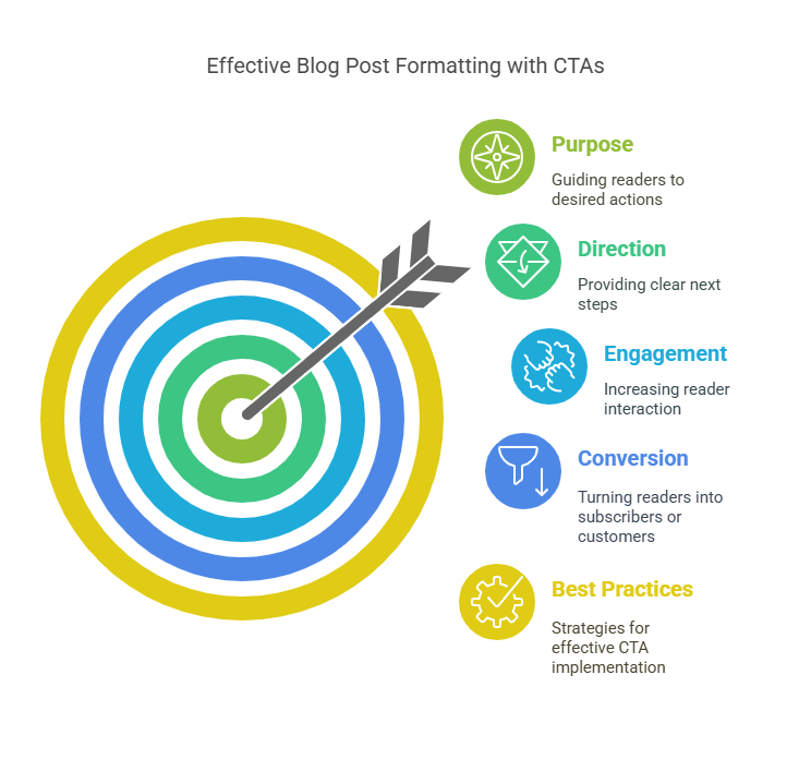
If you write an incredible blog post and forget to tell your readers what to do next, you’re leaving money, traffic, and conversions on the table.
A Call-to-Action (CTA) is the gentle nudge—or bold push—that guides your reader to the next step. Whether it’s subscribing to a newsletter, downloading a resource, or leaving a comment, the CTA is your blog’s closing argument.
Why CTAs Matter in Formatting:
- They provide direction and purpose.
- They increase engagement and conversion rates.
- They create natural flow from one post to another or deeper into your funnel.
Best Practices:
- Use buttons, banners, or styled text to visually distinguish CTAs.
- Keep CTAs above the fold, in the middle, and/or at the end of the post.
- Make the language clear, action-oriented, and benefit-focused.
Not sure where to start?
📧 Subscribe and get our top 10 formatting hacks delivered weekly!
Use one primary CTA per post and pepper in secondary ones if they feel natural. Avoid overwhelming the reader with too many buttons or links.
The key? Match your CTA with your blog’s tone, flow, and reader’s intent. Every post should serve a purpose—and your CTA is the final handshake.
Using White Space to Avoid the Wall of Text
Ever landed on a blog and thought, “Whoa, that’s a lot to read”? That’s not always about length—it’s often about lack of white space.
White space (also known as negative space) is the area between lines, paragraphs, images, and sections. It’s not empty. It’s intentional. It lets your content breathe, your reader relax, and your ideas shine.
Why White Space is Powerful:
- Improves comprehension by 20%
- Increases visual appeal and professionalism
- Keeps readers scrolling by avoiding cognitive overload
How to Format With White Space:
- Use short paragraphs (2–4 lines max)
- Add line breaks between sections, headings, and images
- Avoid cramming multiple ideas into one paragraph
- Use margin and padding styles consistently in your theme
Here’s a quick comparison:
👎 Without white space:
“Blog formatting is a process that includes numerous techniques. From subheadings to visuals and font selection, everything counts. You need to consider readability, SEO, mobile optimization, and more.”
👍 With white space:
Blog formatting isn’t just decoration—it’s strategy.
From subheadings to visuals, font to layout, everything counts.
And if you want your blog to be readable and SEO-friendly, white space is your secret weapon.
Let your content breathe. It makes all the difference.
Mobile Optimization Tips for Blog Formatting
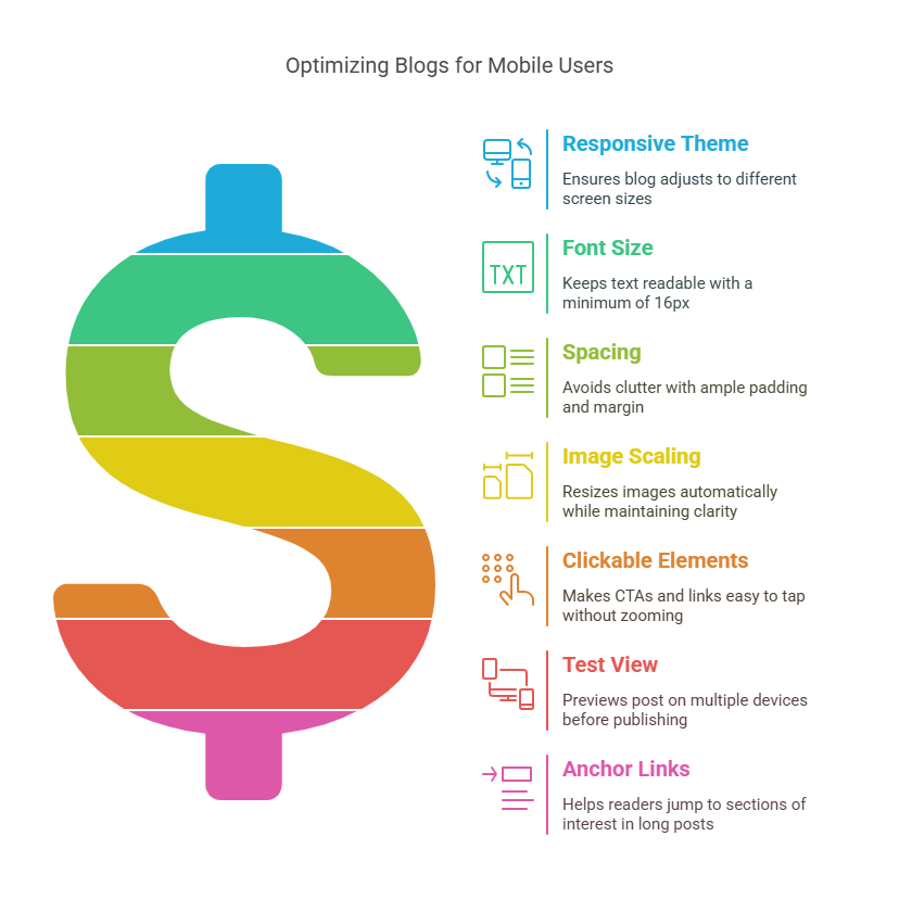
In a mobile-first world, desktop formatting just doesn’t cut it anymore. Over 60% of blog traffic comes from mobile devices, which means how to format a blog post needs to be thought of from the small screen up—not the other way around.
Why Mobile Formatting Matters:
- Poor formatting leads to high bounce rates.
- Google’s algorithm uses mobile-first indexing.
- Mobile users have shorter attention spans and different interaction habits.
Mobile-friendly Formatting Checklist:
✅ Responsive theme: Ensure your blog adjusts automatically to different screen sizes.
✅ Font size: Keep text at least 16px for easy readability.
✅ Spacing: Use ample padding and margin to avoid clutter.
✅ Image scaling: Images should resize automatically and remain clear.
✅ Clickable elements: CTAs and links must be easy to tap without zooming.
✅ Test view: Preview your post on multiple devices before hitting publish.
Bonus: Use tools like Google’s Mobile-Friendly Test to check if your post passes the mobile UX benchmark.
Pro tip: Consider anchor links for long-form posts to help mobile readers jump to sections that interest them most.
Your blog should be just as beautiful and usable on a 6-inch screen as it is on a 27-inch monitor. If not, you’re missing out on a huge slice of your audience.
Formatting for Accessibility and Inclusivity
Accessibility isn’t just about compliance—it’s about caring. Formatting your blog to be usable by people of all abilities is one of the most respectful and professional things you can do as a content creator.
And yes, it also improves SEO and user experience for everyone.
Key Formatting Tips for Accessibility:
- Use descriptive headings and follow a logical H1 → H2 → H3 structure.
- Add alt text to all images that accurately describes the content.
- Ensure contrast between background and text (use online contrast checkers).
- Avoid using color alone to convey meaning (e.g., red = error).
- Use simple language and avoid overly technical jargon when unnecessary.
- Structure your blog for screen readers—short paragraphs, proper punctuation, and clear navigation.
Example of inclusive formatting:
❌ Bad: “Click the green button to continue.”
✅ Good: “Click the button labeled ‘Continue’ at the bottom of the page.”
Inclusive formatting also includes gender-neutral language, avoiding idioms for international readers, and using clear links like “Download the formatting guide” instead of just “click here.”
You’ll not only open up your content to a broader audience—you’ll build trust, authority, and a better web.
Formatting the Conclusion: Wrapping It All Up
The conclusion isn’t the end—it’s the launchpad. It’s your final chance to leave an impression, reinforce key points, and guide the reader forward.
But many bloggers make the mistake of ending abruptly or dragging on too long. When formatting your conclusion, think of it as the closing argument in your blog’s story arc.
Formatting Tips for Conclusions:
- Start with a short summary of what was covered.
- Use bullet points to recap major takeaways (optional).
- End with a strong final statement or insight.
- Include a clear CTA (download, comment, share, etc.).
- Use a visual separator or styled block to make the section distinct.
Wrapping Up: Blog Formatting in a Nutshell
From headlines to subheadings, paragraphing to white space, every part of your blog’s structure affects how people read—and whether they stay.
Remember:
- Keep sentences short and paragraphs tighter
- Use transition words and headings generously
- Emphasize key points with bolding and visuals
- Optimize for mobile, SEO, and accessibility
✅ Now it’s your turn.
Start applying these formatting tips to your next post—and see the difference it makes.
A well-formatted conclusion gives closure and momentum. Don’t just trail off—end with clarity and purpose.
Formatting for Voice Search and Conversational SEO
With smart speakers and voice assistants taking over search queries, your blog formatting needs to catch up. In 2025, voice search isn’t just a trend—it’s a shift in how people discover and consume content.
To win at conversational SEO, you must format your blog post in a way that mirrors natural speech and answers direct questions.
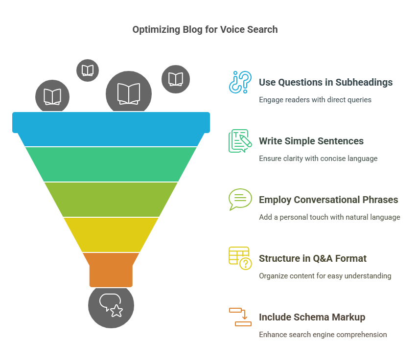
Formatting Tips for Voice Optimization:
- Use questions in subheadings (like FAQs).
- Write in short, simple sentences—average spoken sentences are 12–15 words.
- Use conversational phrases like “Here’s how…” or “Let’s break it down.”
- Structure content in Q&A format, especially for how-to guides and tutorials.
- Include schema markup (if possible) to help Google understand your content better.
Example of voice-optimized formatting:
What’s the best way to format a blog post?
Start with a clear title, followed by an engaging intro. Use short paragraphs, subheadings, and lists to make your post skimmable. Don’t forget your CTA!
By structuring your blog to answer specific, spoken-style queries, you’ll increase your chances of landing in Google’s Featured Snippets or voice results.
How to Format a Blog Post in WordPress
WordPress powers over 40% of the web, so knowing how to format content in this CMS is a must for bloggers.
Step-by-step Formatting Process in WordPress:
- Use the Block Editor (Gutenberg):
- Click the (+) icon to insert blocks (paragraphs, headings, lists, images).
- Select the appropriate heading levels (H2 for main, H3 for subsections).
- Add Images:
- Drag and drop or click “Image” block.
- Fill in alt text with relevant descriptions (including your focus keyword).
- Style Text:
- Highlight and use bold, italics, or blockquote options from the toolbar.
- Use “Separator” blocks to break sections visually.
- Insert Links:
- Highlight text, click the link icon, paste your URL.
- Use Yoast SEO Plugin:
- Optimize your focus keyphrase, meta title, slug, and readability.
- Aim for green lights on both SEO and readability tabs.
- Preview Your Post:
- Use desktop, tablet, and mobile views.
- Fix spacing issues or overflowing elements before publishing.
Using WordPress well means leaning on its strengths: flexibility, plugin support, and clean formatting tools that help your blog post shine.
Formatting for Shopify, Wix, and Other CMS
While WordPress reigns supreme, other platforms like Shopify, Wix, and Squarespace have grown in popularity—especially for ecommerce, service-based, and visual-first blogs.
Formatting in Shopify:
- Go to Online Store > Blog Posts.
- Use the Rich Text Editor to insert headings, links, and images.
- Apply H2 and H3 using the formatting toolbar.
- Use Yoast SEO for Shopify to get real-time SEO suggestions.
Formatting in Wix:
- Use the drag-and-drop Wix Editor or Wix Blog Editor.
- Select text blocks and apply styles manually.
- Use Wix’s SEO panel to edit meta tags, slugs, and keywords.
- Test mobile formatting with Wix’s responsive preview mode.
Formatting in Squarespace:
- Use content blocks for layout.
- Apply headings through style settings.
- Add white space using “spacers” or blank sections.
- Use the built-in SEO panel for meta formatting.
No matter the CMS, the principles remain: structure clearly, format consistently, and optimize for readability and mobile.
Formatting Your Meta Tags and Snippets
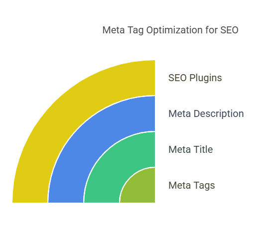
Meta tags don’t show on your blog page, but they show up where it matters most: Google search results.
When you learn how to format a blog post, don’t forget the SEO basics—your meta title and description can be the difference between a scroll-past and a click.
Formatting Meta Tags:
- Meta Title (SEO Title):
- Keep it under 60 characters.
- Include the focus keyword near the beginning (e.g., how to format a blog post).
- Add a power word (ultimate, essential, expert).
- Meta Description:
- Max length: 155 characters.
- Summarize what the blog is about.
- Include the focus keyword and a benefit-driven phrase.
Example:
Title: How to Format a Blog Post Like a Pro | 27 Easy Tips
Description: Learn how to format a blog post with smart structure, SEO tactics, and formatting tips for better readability, engagement, and traffic.
Most CMS platforms (including WordPress and Shopify) allow you to input this info directly in the post settings or through SEO plugins.
SEO Plugins: Yoast SEO Best Practices
Yoast SEO is every blogger’s best friend when it comes to formatting for readability and search visibility.
Key Yoast SEO Checks to Format By:
- Focus keyphrase in the intro ✅
- Subheading distribution (every 300 words) ✅
- Passive voice usage < 10% ✅
- Transition words in 30%+ of sentences ✅
- Flesch Reading Ease Score 60–70 ✅
- Keyphrase in meta title and description ✅
Features to Use:
- Green/Orange/Red lights give real-time feedback.
- The Insights tab shows word count, reading level, and keyword density.
- Internal link suggestions help boost site structure.
Use Yoast to optimize as you write, not just after. It helps shape your post into an SEO powerhouse.
Common Formatting Mistakes and How to Avoid Them
Even the most seasoned writers stumble on formatting now and then. The good news? Most mistakes are easily avoidable.
Common Errors:
❌ Walls of text
❌ Inconsistent heading structure
❌ Overuse of bold/italics
❌ Missing alt text on images
❌ No call-to-action
❌ Bad font choices
❌ Skipped mobile preview
❌ Neglecting meta descriptions
Fixes:
✅ Break up content every 2–4 lines
✅ Follow a clear heading hierarchy (H1 → H2 → H3)
✅ Use emphasis sparingly
✅ Use tools like Hemingway for readability
✅ Preview on multiple devices
✅ Use Yoast or RankMath for meta fields
Think of formatting as your silent salesman—it does the heavy lifting when you’re not in the room.
Testing and Previewing: Final Checks Before You Publish
Before you hit that glorious “Publish” button, take a few minutes to test, preview, and polish your blog post like a professional editor.
Pre-Publish Checklist:
✅ Headings structured properly?
✅ Intro includes your focus keyword?
✅ Paragraphs and lists broken up nicely?
✅ Images have alt text?
✅ Mobile view looks clean?
✅ Internal/external links work?
✅ SEO plugin lights all green?
Use the Preview mode in WordPress, Wix, or Shopify to view your blog on different screen sizes. Then ask: Does it feel smooth? Readable? Useful?
If yes—congrats. You’re ready to go live with confidence.
Conclusion: Your Blog Deserves to Shine
Formatting isn’t a final touch—it’s a foundational strategy. When you know how to format a blog post the right way, you amplify everything else: your voice, your value, your visibility.
From skimmable headlines to clean visuals, proper spacing, and SEO-rich subheadings, each element plays a role in keeping your readers engaged and your content ranking.
So, whether you’re writing your first post or your 500th, remember this: A well-formatted blog doesn’t just get read—it gets remembered.
Now, go format fearlessly.